Mobile Information Architecture
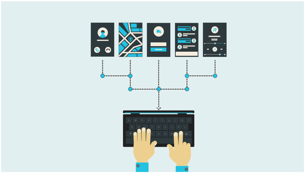
Basically, Information Architecture makes it easy for people to understand their surroundings and find what they are looking for, in real world as well as online. It is the structure of shared information which is designed for website or application allowing us to understand where we are as users and where the information we want is in relation to our position. The sitemaps, hierarchies, categorizations, navigations and metadata all are results of Information Architecture itself.
Now, the question is should mobile information architecture differ from desktop information architecture? Answer is yes. This is because Information architecture depends upon physical dimensions and capabilities of the device. For example tablet is remarkably bigger and heavier than smartphone and thus we are on the move smartphone is preferred over tablet. On a contrary note, if one has lot of information to look at, then he/she will prefer a bigger screen (tablet or desktop). Information architecture is important part of creating good user experience. Currently, Information architecture for desktop has common practice but mobile information architecture is not that much established. Here, mobile information architect comes into picture. Mobile information architect should elucidate the website content to the mobile context. Mobile information architecture can be best defined with the sitemaps, hierarchies, categorization, etc. All these provide the relationship of content to the other content and represent path for user to travel through information space. These are very much similar to the desktop information architecture, but there are a few things specific to mobile that we need to consider while creating mobile information architecture. For example, mobile information architect should offer only what is absolutely required by user to reduce the threat of wrong choices. Few tricks for creating effective mobile.
information architecture:
• Focussed user goals
• Task-centred
design
• Designing simple elements with little embellishment
• Less
options or choices
• Prioritize links and content
Latest Blog

What are Progressive Web Apps (PWAs)
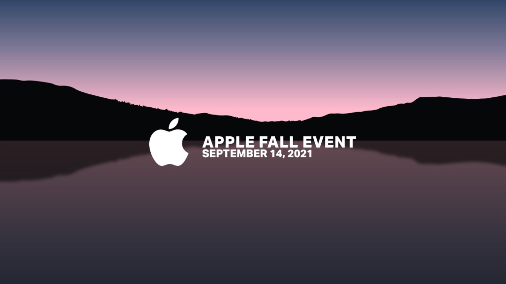
Apple Event September 2021 Recap
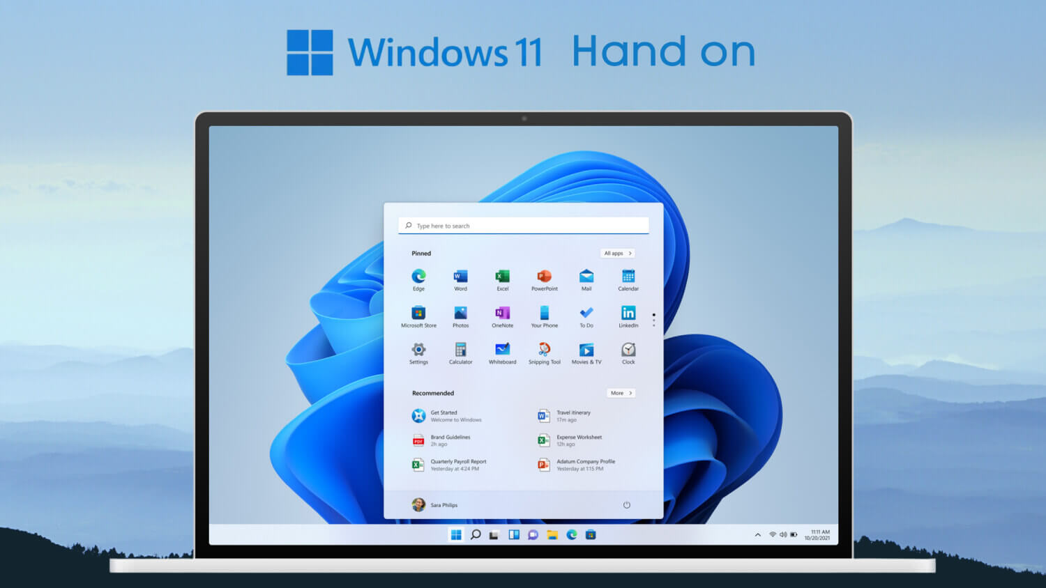
Windows 11 hands-on: Here's Everything You Need to Know About Microsoft's Latest Operating System
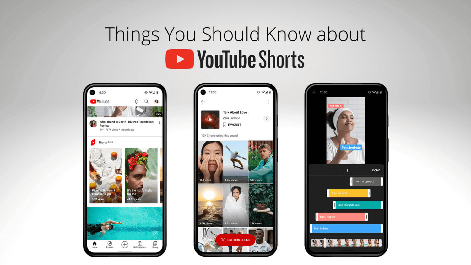
YouTube Shorts - Things You Should Know
8 New Features of Android 12 You Didn’t Know
Android 10: Top feature you need to know!
Akshay Gangwar
50 mins ago
Temperature & Humidity IOT Solutions for Food, Agriculture and Medical Industry
Akshay Gangwar
50 mins ago
HTC Reportedly Planning to Re-enter Indian Market in August
Akshay Gangwar
50 mins ago

Apple OS X Server: File Transfer Protocol
Akshay Gangwar
50 mins ago
